When Graphic Design Becomes Part of the Building
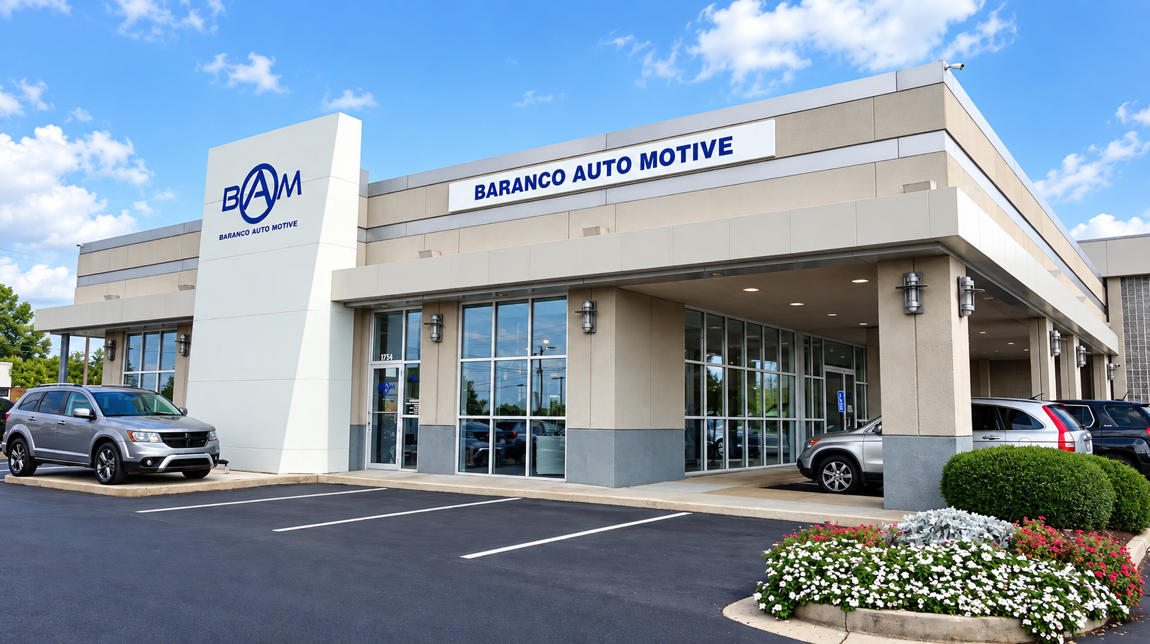
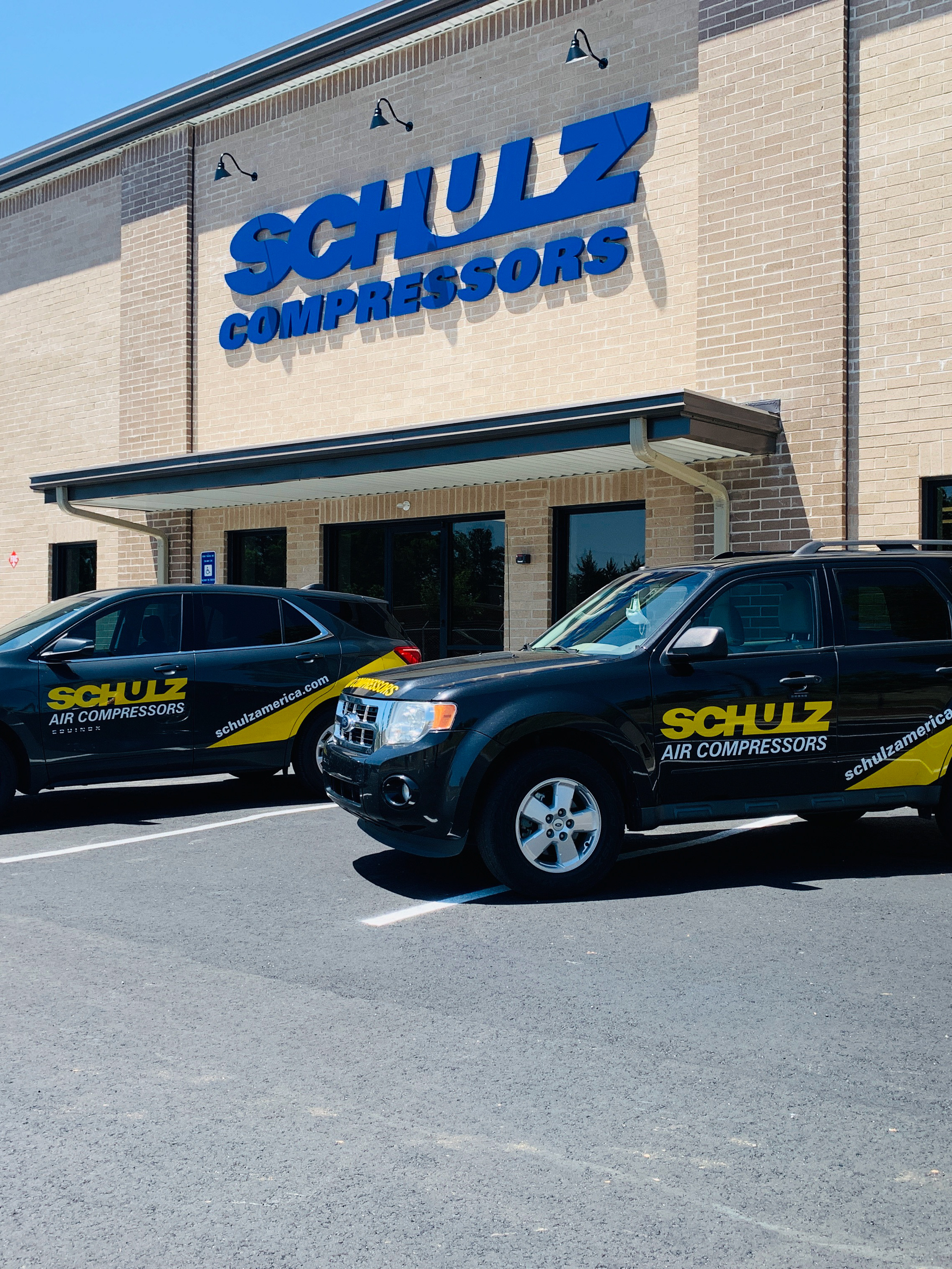
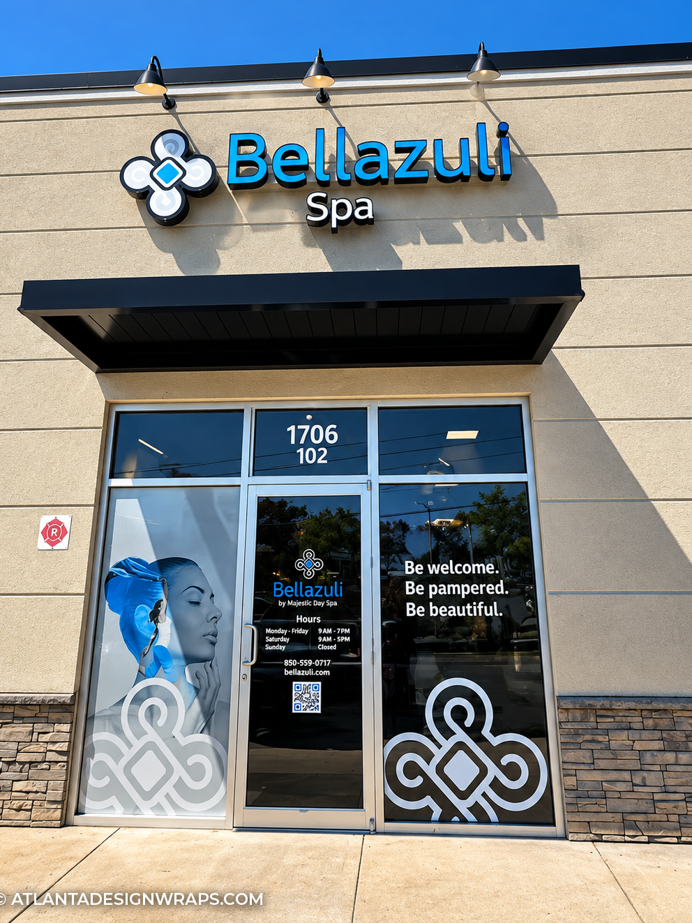
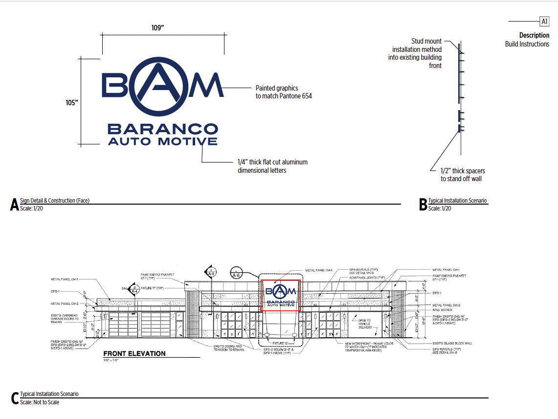
Exterior commercial building signage featuring coordinated corporate branding, dimensional logo elements and clean architectural placement. This project highlights architectural sign design, exterior business signage, environmental branding and commercial graphic design for businesses in Atlanta and Metro Atlanta.
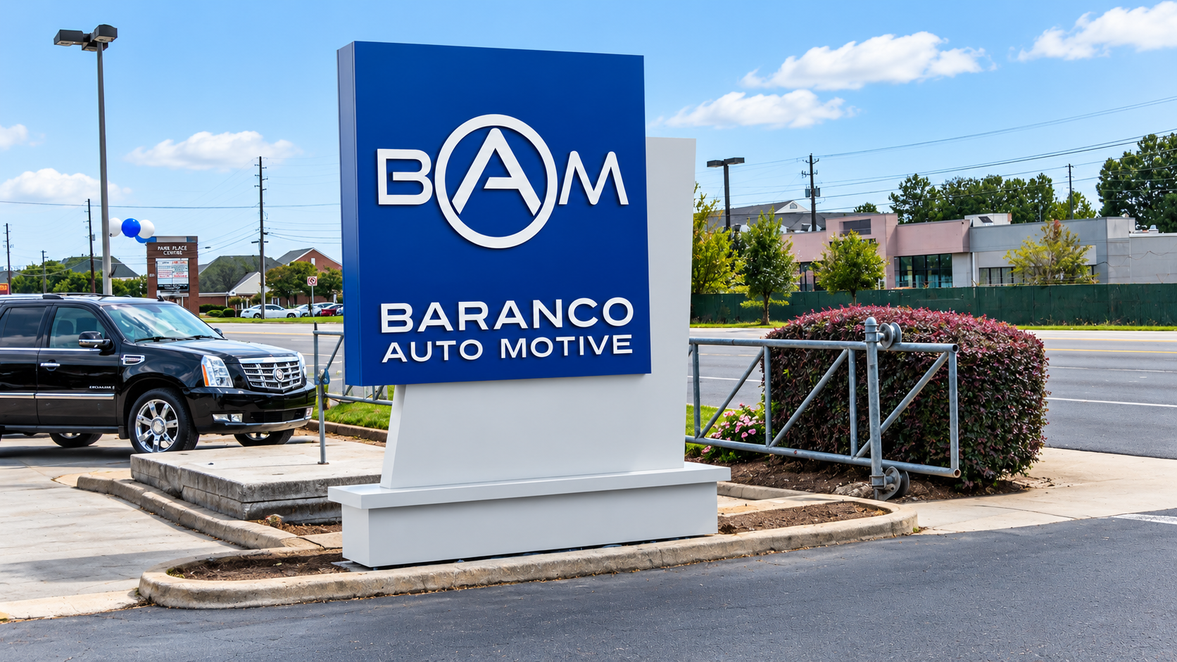
Freestanding monument sign featuring custom corporate branding, dimensional lettering and a clean architectural structure designed for strong roadside visibility. This project highlights monument signs, architectural signage, commercial business signs and environmental graphic design in Atlanta and Metro Atlanta.
From Concept to Fabrication
The technical drawings become real-world signage through fabrication, structural assembly and on-site installation. This behind-the-scenes view shows the monument sign structure during construction before the final branded faces and lettering were completed.

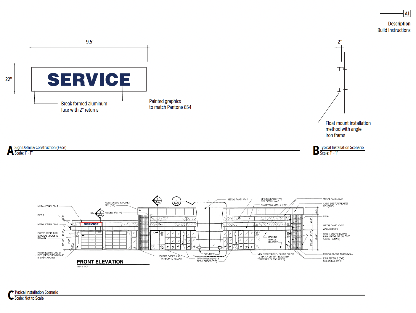
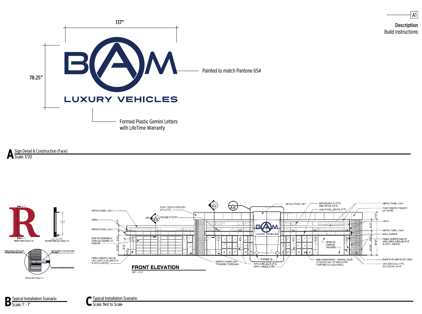

Custom architectural sign fabrication in Atlanta showing precision-cut aluminum lettering and logo components prepared for commercial sign assembly.
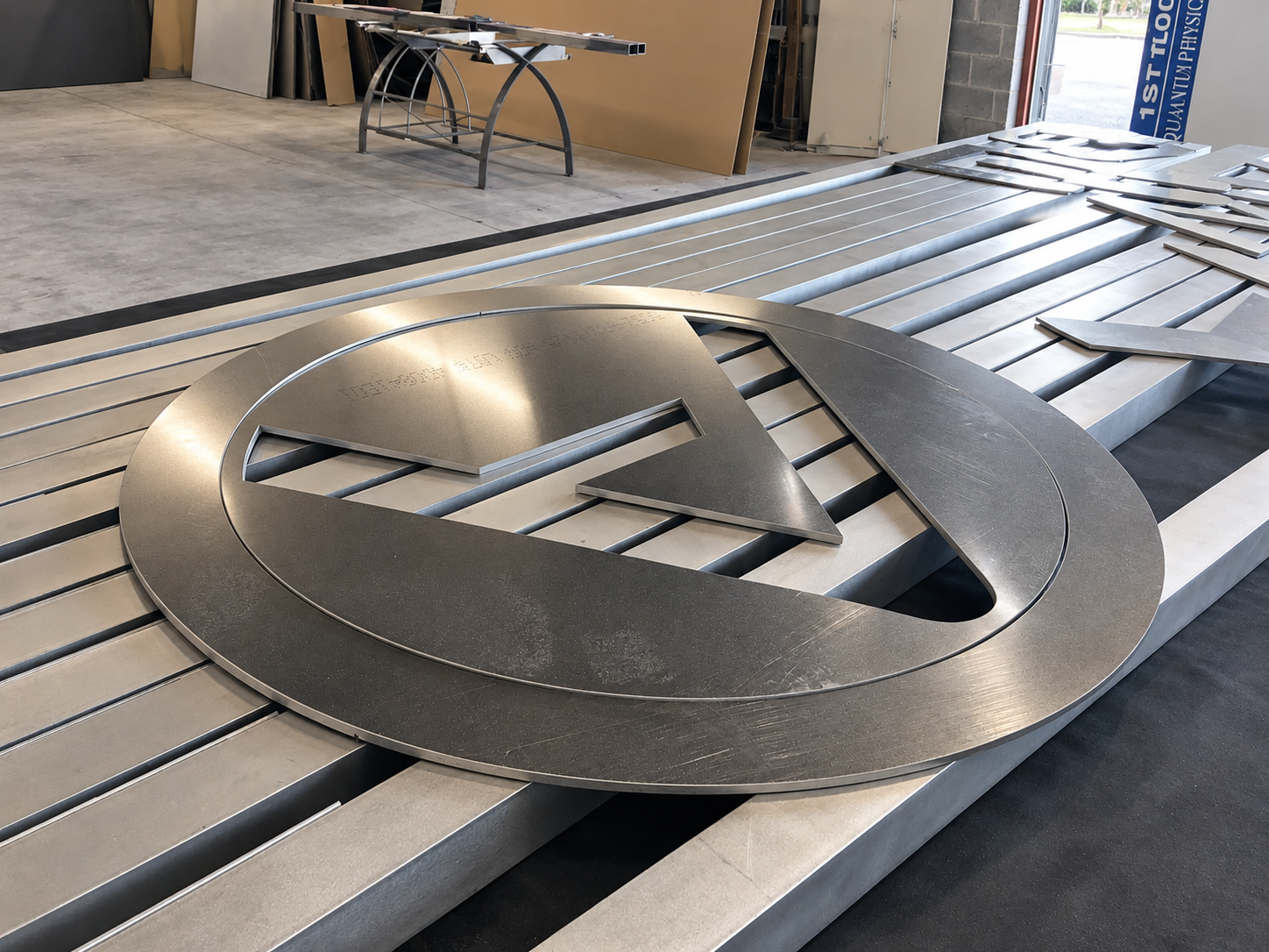
Fabricated dimensional metal logo in production, demonstrating the precision and material craftsmanship behind custom architectural signage.
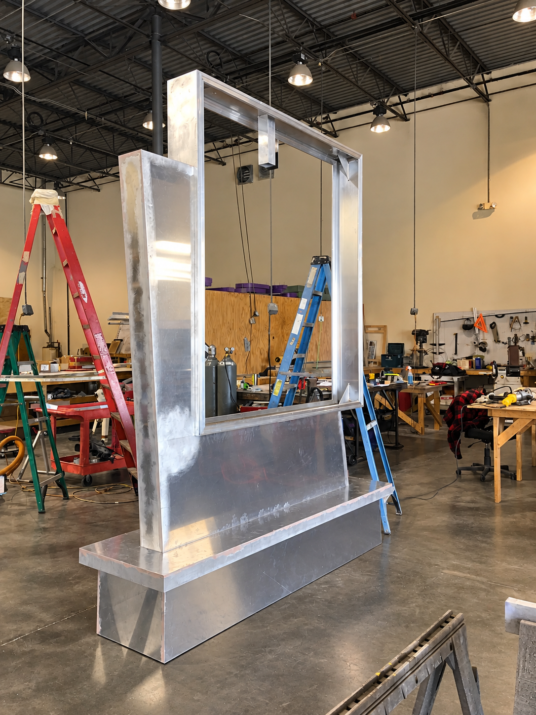
Custom aluminum monument sign frame during fabrication, highlighting the structural construction and manufacturing process behind finished architectural signage.
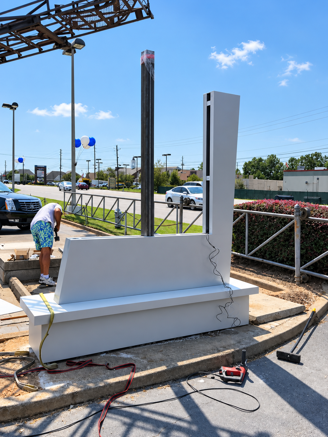
Monument sign installation in progress, showing the structural base, support system and on-site preparation before final branded components are installed.
Project Snapshot
Project Type: Exterior Architectural Signage
Applications: Building Signage & Monument Sign
Design Focus: Corporate Identity & Environmental Branding
Related Services: Graphic Design, Architectural Sign Design, Large-Format Graphics & Production Artwork
Market: Atlanta & Metro Atlanta
Applications: Building Signage & Monument Sign
Design Focus: Corporate Identity & Environmental Branding
Related Services: Graphic Design, Architectural Sign Design, Large-Format Graphics & Production Artwork
Market: Atlanta & Metro Atlanta
A sign is often the first piece of a brand people see in the real world.
Before someone walks through the door, visits the website or speaks with a salesperson, the building itself is already communicating.
That is why architectural signage deserves the same level of design attention as a logo, website or marketing campaign.
For this automotive business project, the visual identity was extended across both the building facade and a freestanding monument sign, creating a consistent physical presence that could be recognized from the parking lot and the road.
The project is a good example of how graphic design, architectural signage and manufacturing come together to turn a brand into part of a physical environment.
Architectural Signage Starts With Graphic Design
A strong sign does more than display a company name.
It has to work with the building, the surrounding environment and the way people approach the property.
That means considering:
Logo proportions
Typography
Brand colors
Viewing distance
Traffic direction
Building scale
Contrast
Placement
Materials
Lighting
Structural limitations
A logo that looks perfect on a business card may need to be adjusted when it becomes several feet wide on the side of a building.
That is where experienced graphic design in Atlanta becomes important.
The designer has to think beyond the artwork itself and understand how that artwork will perform once it becomes a physical sign.
Exterior Building Signs as Brand Architecture
Exterior building signage becomes part of the architecture.
The sign should feel intentional—not like something added after the building was finished.
For this project, the clean blue-and-white identity was carried across the facade in a way that complemented the neutral architectural palette.
The result is simple, professional and highly visible.
This type of commercial building signage can help establish:
Business identity
Street presence
Professional credibility
Location recognition
Brand consistency
A successful sign should make it easier for customers to understand where they are and whose business they are approaching.
Monument Signs Create Street-Level Recognition
Building signage works best when the property is already visible from the road.
But many businesses need an additional sign positioned closer to traffic.
That is where monument signs become valuable.
A monument sign creates a permanent branded presence at the edge of a property and can be especially effective for:
Corporate offices
Medical facilities
Automotive businesses
Professional services
Industrial properties
Retail centers
Multi-tenant properties
The design needs to remain readable from a moving vehicle while still feeling connected to the architecture behind it.
For the automotive project shown here, the monument sign uses the same visual identity as the building signage, creating a consistent experience from the street to the entrance.
Monument Sign Design Is About Simplicity
The best monument signs are often the simplest.
Drivers usually have only a few seconds to see them.
That means hierarchy matters.
A successful design normally prioritizes:
Brand first.
The company identity needs to be immediately recognizable.
The company identity needs to be immediately recognizable.
Business name second.
The viewer should understand what company occupies the property.
The viewer should understand what company occupies the property.
Supporting information only when necessary.
Trying to place too much information on a roadside sign usually reduces its effectiveness.
Good sign design removes what is unnecessary so the important information becomes easier to see.
From Visual Identity to Environmental Branding
Architectural signage is part of a larger category often described as environmental graphic design.
Environmental graphics bring a visual identity into physical spaces.
That can include:
Building signs
Monument signs
Directional signs
Interior signs
Lobby graphics
Window graphics
Wall graphics
Wayfinding
Dimensional lettering
Branded environments
The objective is consistency.
A customer should be able to move from the road, into the parking lot, through the front door and into the building while seeing the same visual language throughout the experience.
That is how graphic design becomes environmental branding.
Sign Design Must Consider Manufacturing
One of the biggest differences between digital design and architectural signage is manufacturing.
A sign eventually has to become a physical object.
That changes the design process.
Materials have thickness.
Letters require mounting.
Panels need structure.
Edges need finishing.
Lighting may need space.
Fasteners need placement.
Weather exposure affects material choices.
Because of these realities, professional sign design should consider fabrication from the beginning.
The designer needs to understand what can realistically be manufactured—not simply what looks attractive on a computer screen.
Materials Shape the Final Sign
Architectural signage can be produced using many different materials depending on the application.
Common options include:
Aluminum
ACM panels
Acrylic
PVC
Dimensional letters
Routed panels
Painted finishes
Vinyl graphics
Printed graphics
Illuminated components
Architectural substrates
Each material changes the appearance, durability and construction of the finished sign.
For exterior applications, material selection also has to account for sunlight, rain, temperature changes and long-term exposure.
This is why sign manufacturing and graphic design should not be treated as completely separate processes.
The design needs to anticipate production.
Dimensional Signs Add Physical Presence
Flat graphics communicate information.
Dimensional signs add depth.
Raised lettering, routed logos and fabricated panels create shadows and physical separation from the building surface.
That depth can make signage feel more architectural and permanent.
Dimensional sign design can be particularly effective for:
· Corporate offices
· Dealerships
· Professional buildings
· Retail businesses
· Hospitality
· Medical facilities
Used correctly, dimensional elements create visual interest without making the sign overly complicated.
Brand Consistency Across Multiple Sign Types
One of the most important parts of architectural signage is consistency.
The monument sign should not look like one company while the building sign looks like another.
Typography, proportions, colors and logo usage should all follow the same visual identity.
This is especially important for businesses with multiple physical applications.
The same brand might eventually appear on:
Building signage
Monument signs
Window graphics
Interior signs
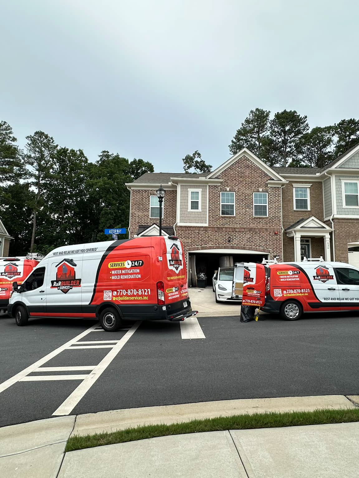
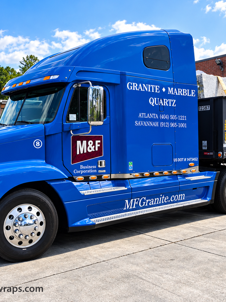
Fleet vehicles
Printed marketing
Digital advertising
Trade show graphics
Strong branding creates a visual system that can move between all of those applications without losing its identity.
Graphic Design for Signs in Atlanta
Atlanta Design Wraps approaches signage from a graphic-design-first perspective.
The goal is not simply to fill a panel with a logo.
The goal is to understand how that brand should appear at architectural scale.
That includes balancing:
Brand identity + readability + materials + environment + manufacturing
Depending on the project, that may involve developing the visual design, preparing production artwork, coordinating specifications and working with appropriate sign fabrication and installation resources.
The result should feel like part of the property—not an afterthought.
Architectural Signs and Commercial Branding
Architectural signage becomes especially valuable when it is considered as part of a broader brand system.
A business may have a strong logo but still appear inconsistent if:
The building sign uses different colors
The monument sign uses another typeface
The vehicles look unrelated
The windows use different branding
Interior graphics do not match
A coordinated visual identity solves that problem.
That is why our work often connects graphic design, signs, window graphics, vehicle branding and large-format graphics rather than treating each application as an isolated project.
Designing for Visibility in Atlanta
Atlanta presents a unique signage environment.
Businesses may be seen from:
Busy multilane roads
Commercial parking lots
Office parks
Industrial areas
Retail corridors
Pedestrian environments
Every location creates different viewing conditions.
A sign beside a high-speed road needs a different hierarchy than a storefront sign viewed from a sidewalk.
A monument sign needs different proportions than lettering mounted twenty feet above the ground.
Good architectural signage responds to how people will actually see it.
Branding Beyond the Screen
Graphic design becomes especially powerful when it moves beyond digital media.
A logo on a website may be seen for seconds.
A commercial sign can remain visible for years.
It becomes part of the customer's daily environment.
That is why architectural signage should be treated as a long-term branding investment.
When design, manufacturing and placement work together, the sign does more than identify a property.
It helps define the business.
Architectural Sign Design in Atlanta
Atlanta Design Wraps develops visual branding for businesses that need their identity to work across real-world applications.
Our broader capabilities include:
· Architectural sign design
· Monument sign graphics
· Exterior business signage
· Environmental graphics
· Window graphics
· Large-format printing
· Vehicle graphics
· Fleet branding
· Commercial graphic design
Whether the project begins with an existing visual identity or requires a new creative direction, the objective is the same:
create branding that remains recognizable wherever customers encounter the business.
From Concept to Physical Brand Presence
The strongest commercial brands do not exist only on screens.
They appear on buildings.
They guide customers from the street.
They identify locations.
They move through traffic.
They become part of the environment.
That is where graphic design and architectural signage meet.
And when those two disciplines are treated as one connected process, a sign becomes much more than a sign.
It becomes part of the brand.